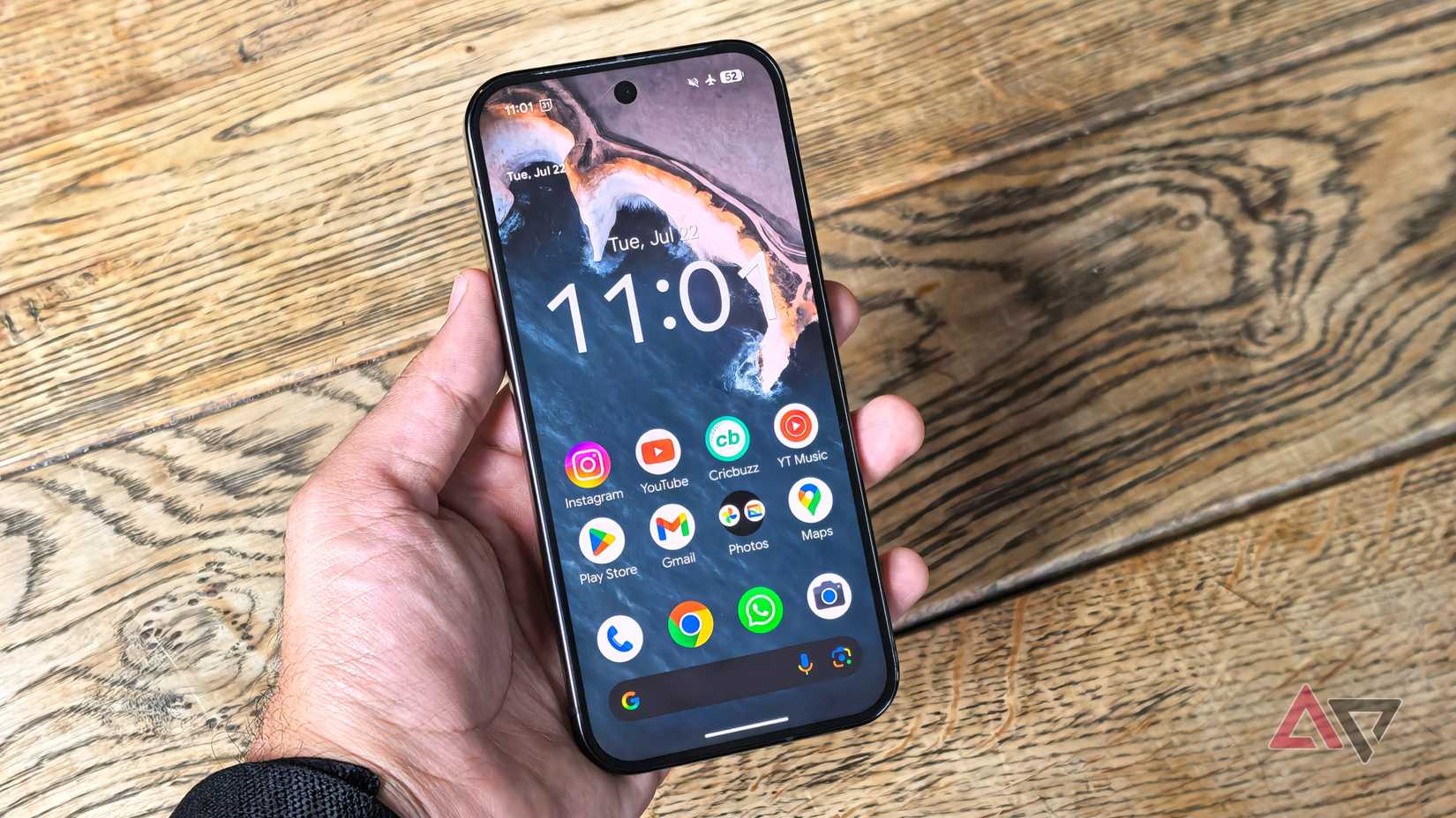
The Pixel lineup is often lauded as the gold standard for Android, offering a clean, simple, and bloat-free experience that many other manufacturers can’t match.
However, simple doesn’t always mean perfect. Despite years of refinements and iterations, the Pixel user interface still has several quirks and rough edges that affect my daily user experience.
Let’s dig into the most annoying Pixel UI issues – the ones that continue to be unnecessary sources of frustration and that still irritate me every time I pick up my phone.
A below-average Private Space implementation
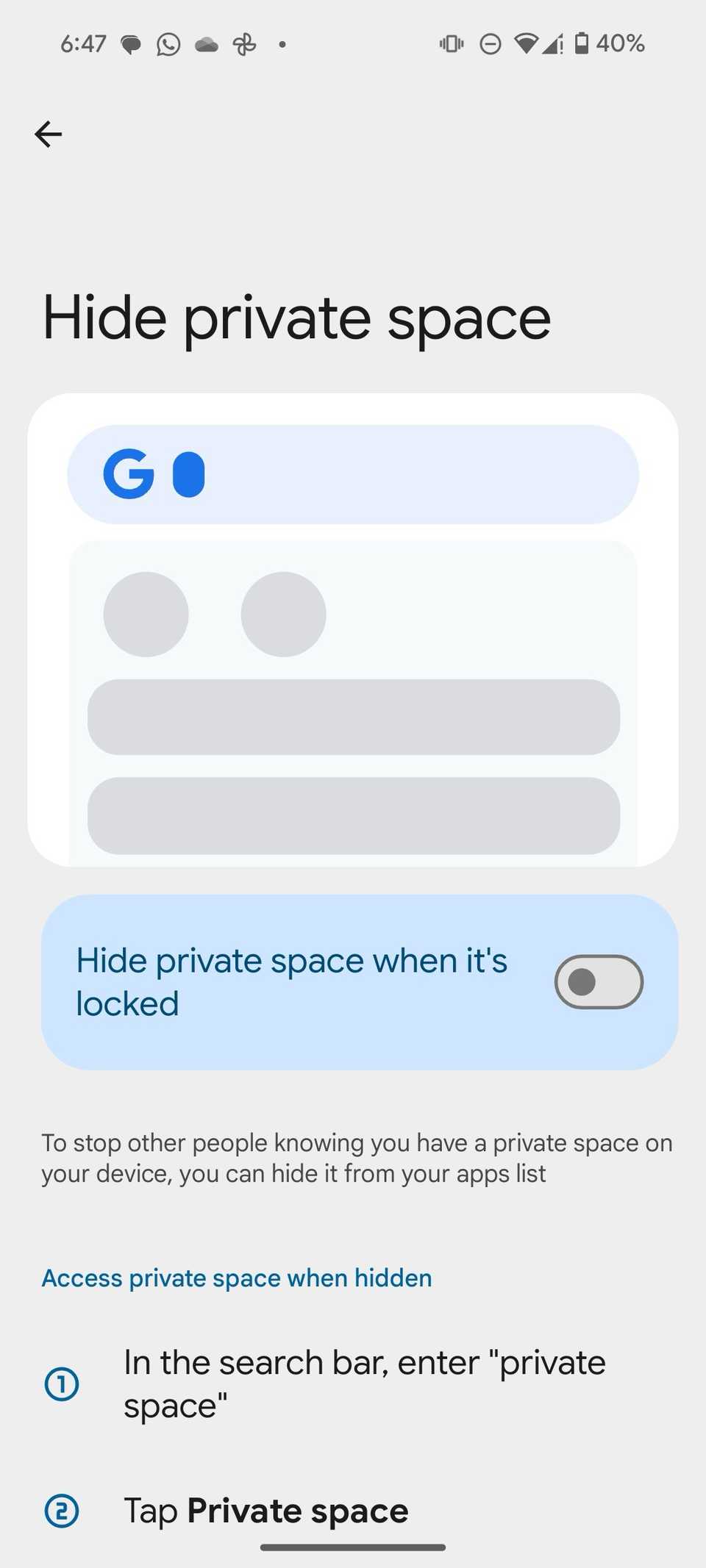
The way the Pixel UI handles privacy is one of the most frustrating things I deal with, specifically when it comes to Private Space. It feels less like a polished feature and more like Google just offering a user profile to the main OS and calling it a day.
For me, the biggest flaw is that Private Space is essentially just a locked-down Android profile. That’s a huge distinction compared to the seamless Secure Folder experience other OEMs offer.
Because it’s a separate profile, it creates a wall between two identities on the phone. That’s why transferring files is a nightmare.
I can’t just move a document or a photo from my main gallery to my Private Space. I have to go through multiple steps that completely break the flow of securely managing my data.
There is also duplication of features. Why do I have three different places to hide a file?
- Private Space: A separate profile for apps and files.
- Google Photos Locked Folder: For photos and videos only.
- Files by Google Safe Folder: For any type of file.
It’s confusing and a prime example of an annoying Pixel UI experience.
A major change in the notification panel
Let’s talk about a change that sums up the idea of fixing something that wasn’t broken.
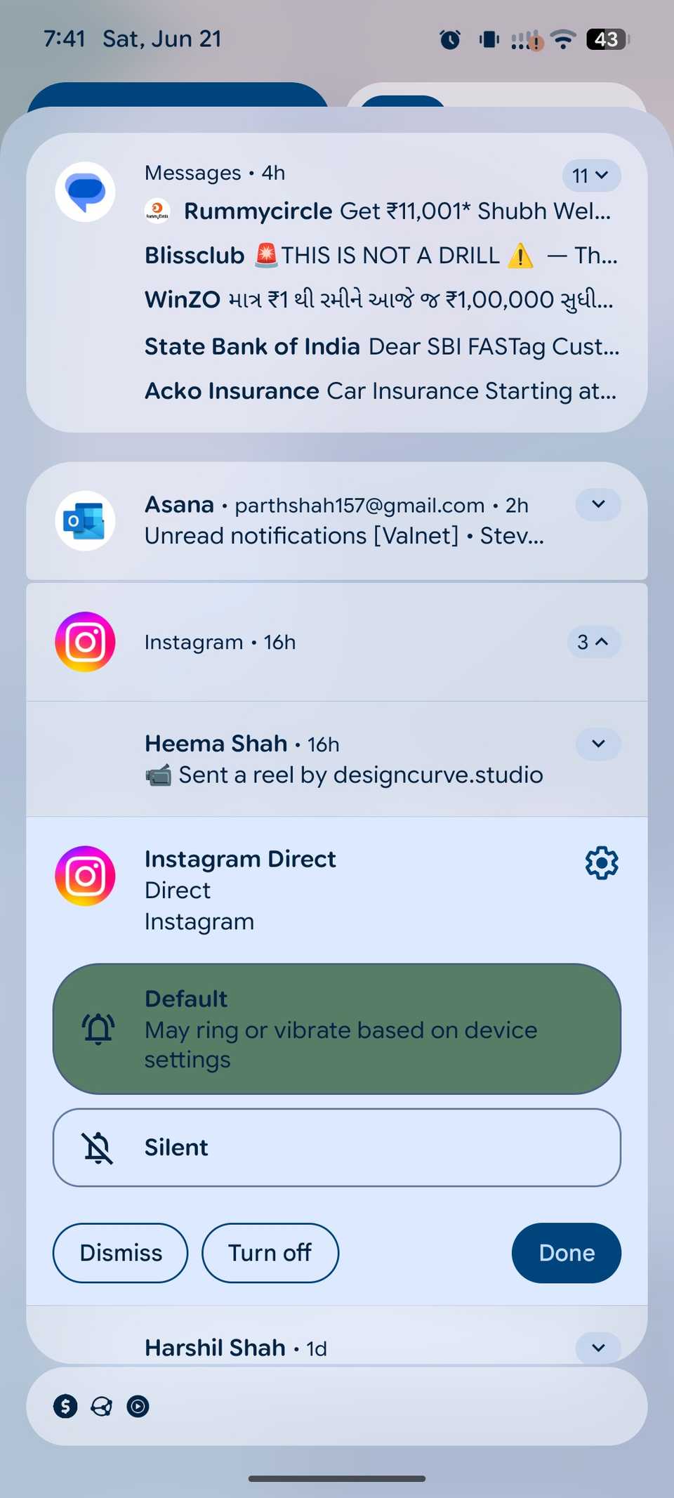
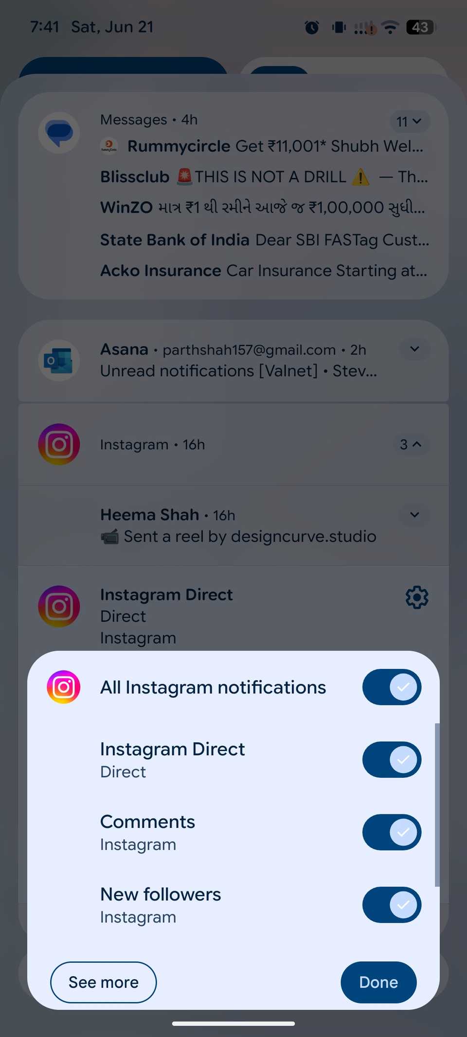
For years, the notification flow was intuitive: an app annoys me, I long-press the notification, and I get a simple toggle or a clear option to silence those alerts permanently. It was fast, reliable, and ingrained in my muscle memory.
Now, Pixel UI displays two options: Dismiss and Turn off. This is a UX disaster. I can literally swipe the notification away to dismiss it.
So why is a duplicate function prominently featured in the long-press menu? I only want to deal with the Turn off menu so that I can disable notifications entirely.
It’s a change for the sake of change and adds an extra layer of confusion.
Persistent search bar on the home screen
The home screen features on the Pixel UI are a classic example of Google prioritizing its services over my control of my own device.
My biggest irritation with the Pixel UI starts on the home screen: the persistent Google Search bar at the bottom and the At a Glance weather/event widget plastered to the top.
Let me be clear: I know I have a Google phone. I use Google services constantly. Still, I should have the ability to decide what takes up prime real estate on my display.
The search bar at the bottom is the worst offender. It’s always there, taking up valuable space that I could use for another row of apps or my custom widgets. The same goes for the At a Glance widget at the top.
I appreciate the concept. It’s smart and contextual. But what if I want a different weather widget? I can tweak what information it shows, but I can’t banish it entirely.
Search bar at the top of the Settings and App drawer menu
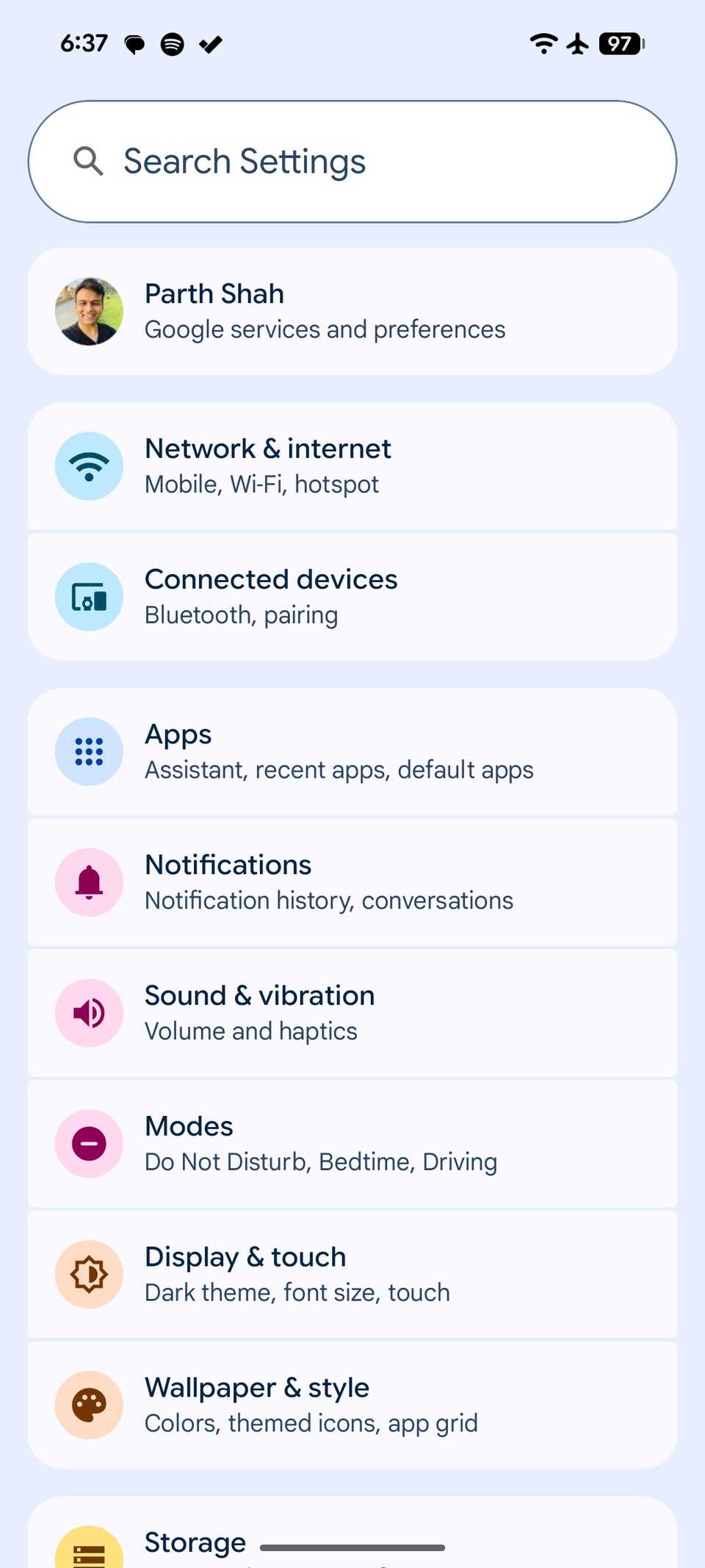
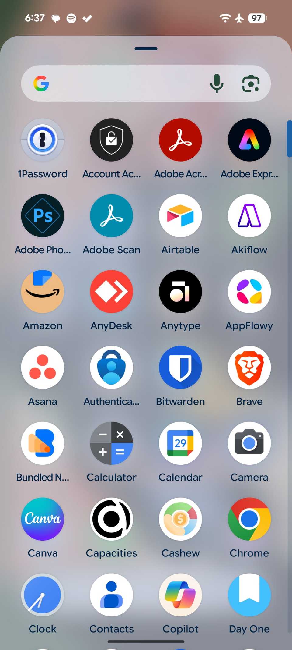
Google often misses the mark on real-world, one-handed usability. I use my Pixel 8 constantly with one hand. The placement of search bars in the core UI is a daily source of frustration for me.
Take the Settings app. The moment I open it, my goal is to often find one specific setting buried in that list. Naturally, I want to tap the search bar, but it is awkwardly placed at the top.
Given that the Settings menu is one of the densest parts of the UI, the search bar should be placed at the bottom.
The situation is identical in the App Drawer. When I swipe up to find an app that isn’t on my home screen, the search bar appears at the top. It’s placed as far away from my thumb as possible.
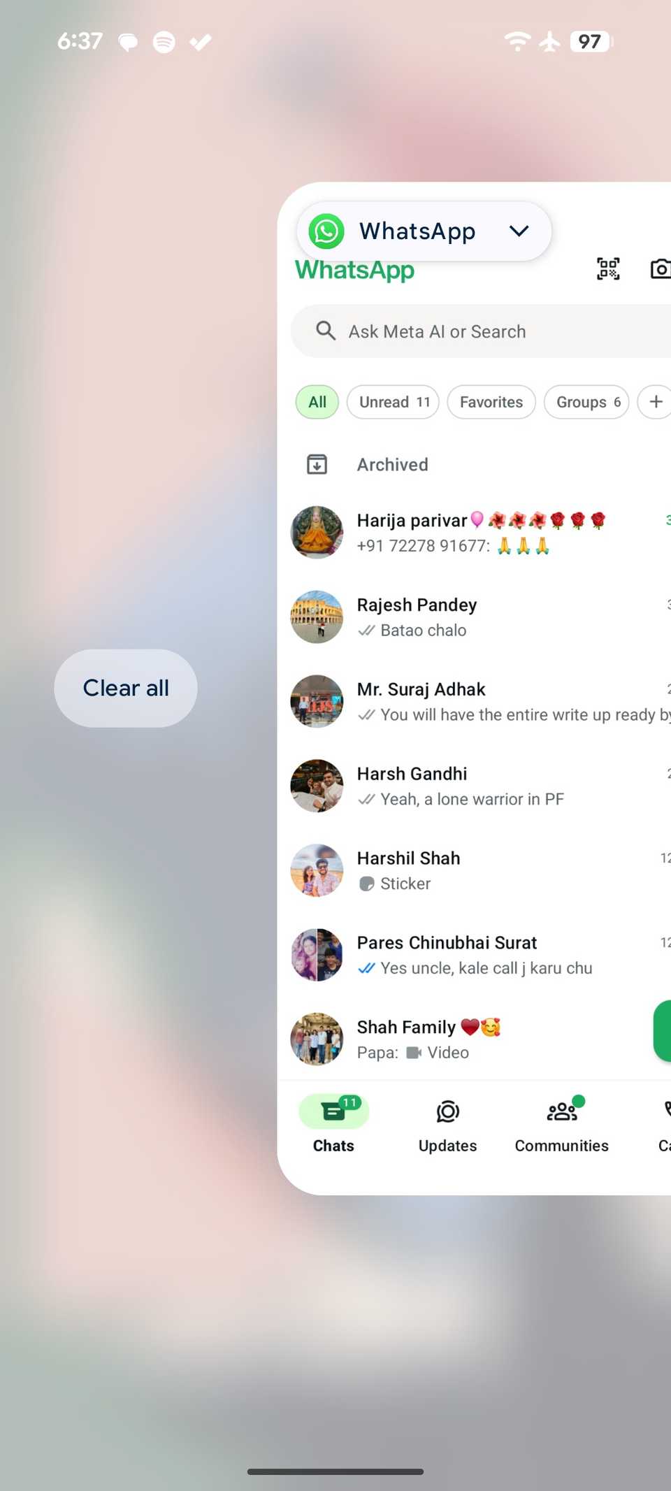
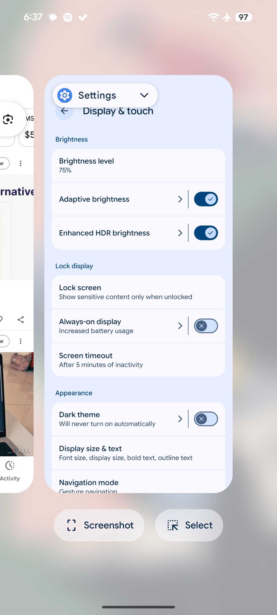
The placement of the Clear all button in the app switcher is another one of those Pixel UI decisions that makes me question if the design team actually uses their own phones in real life.
When I’m done with a long work session, or I just want a clean slate, my immediate goal is to tap Clear all and move on. But that button is buried at the very end of the horizontal carousel.
On a typical day, I might have seven to eight apps open. I have to swipe left, past every single recent app, until I finally get to the end of the line.
This is a terrible design in terms of user flow. It should be pinned to the bottom of the screen.
Inability to search for local files
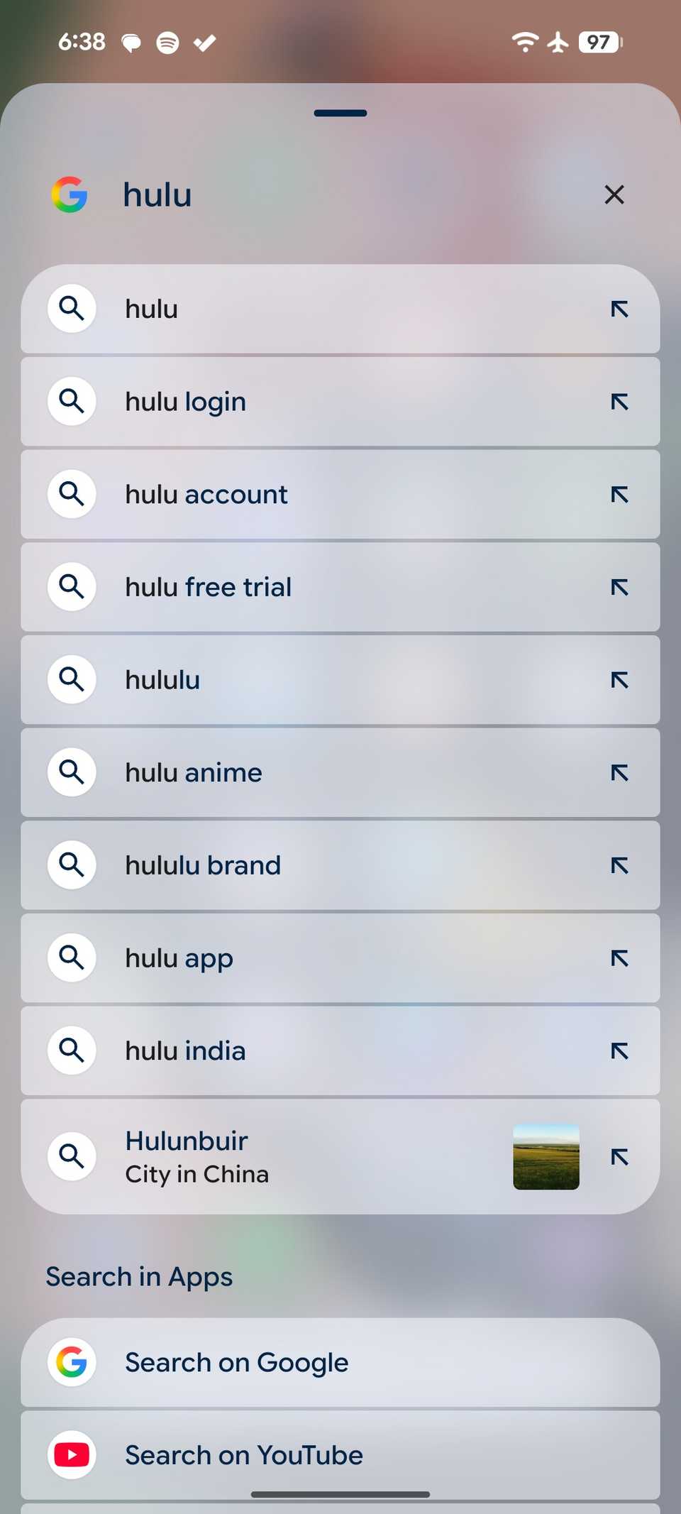
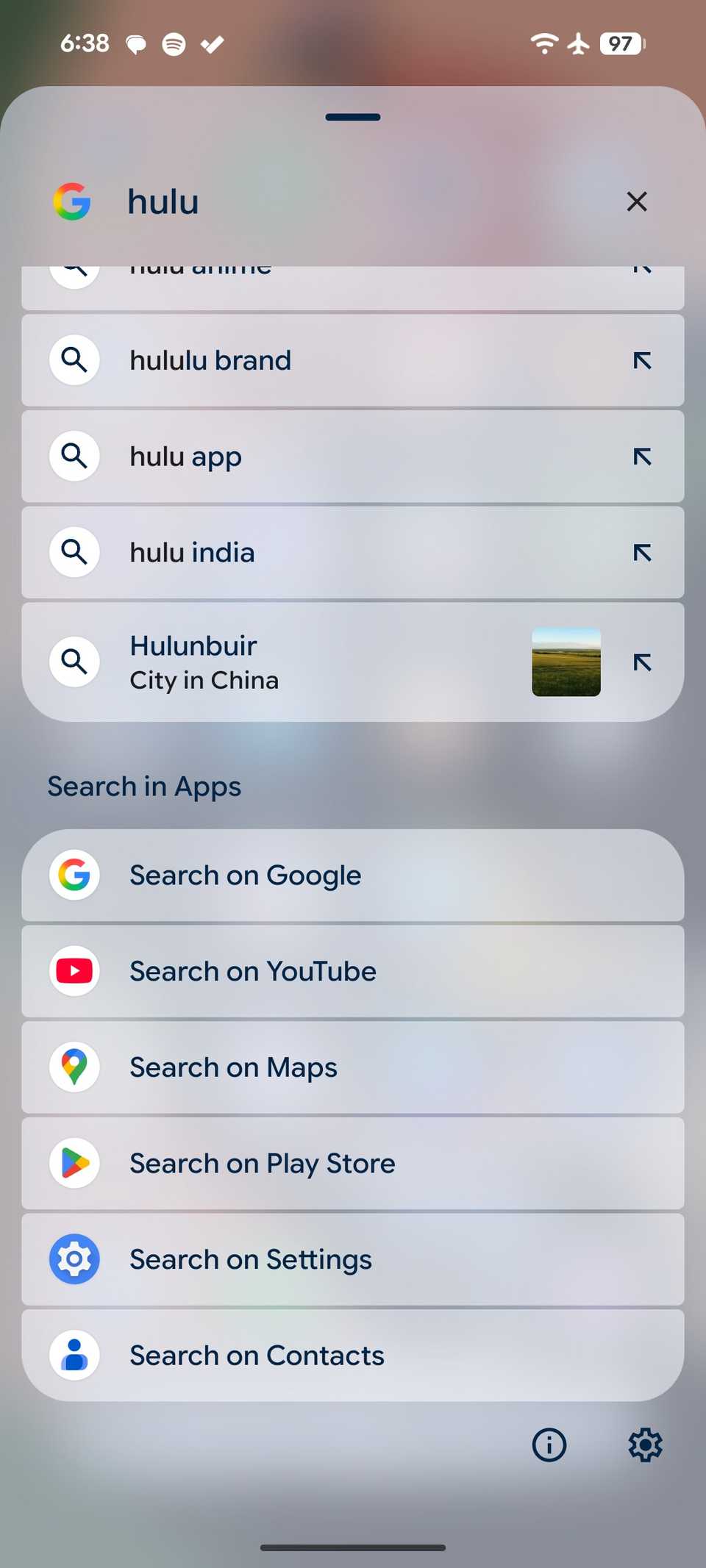
I have already ranted about the persistent search bars, but what makes them annoying is their uselessness for local files. Sometimes, I want to use the search bar to find a local PDF or a video on my Pixel.
However, it runs the search query through the web and other Google services like the Play Store, YouTube, and Contacts, and completely ignores the files sitting on the local storage. I must open the Files app and find it manually.
When it comes to the mobile hotspot menu, my complaints here are all about missing power-user features. Things that have been standard on competing Android phones for years.
Whenever I need to share my connection, the Pixel’s hotspot menu is bare-bones. For instance, I can’t generate a one-time password or set a data limit for connected devices. It’s a total loss of control over my cellular plan.
And speaking of control, let’s circle back to the home screen. There is no way to tweak the app icon layout. I can’t adjust the column spacing, and I can’t arrange my icons the way other launchers allow.
I would love to see more customization options in the future Pixel UI updates.
Pixel UI flaws
It’s easy to focus on the flashy new features, but the real test of a UI is how it handles everyday interactions.
While the Pixel’s software is powerful, these quirks chip away at its polish. They are not massive technical hurdles; they are minor design tweaks that would result in huge quality-of-life improvements for millions of Pixel owners.
Hopefully, Google will prioritize refining the fundamentals over adding more features that few people use. After your Pixel receives Android 16, make sure to disable these settings to avoid unnecessary headaches.


